 HOME UNIFORM |
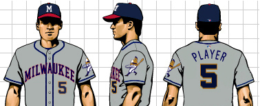 ROAD UNIFORM |
Philosophy:
This
concept draws largely from the American Association Milwaukee Brewers,
a powerhouse for fifty years and Milwaukee's first great baseball team. From
1902 through 1952 they were dominant in their league, and it was that
success that paved the way for the Braves to move from Boston in 1953.
Many
baseball greats from Al Simmons to Johnny Logan to manager Casey Stengel
to owner Bill Veeck got their start with the "Brews," and many
older Milwaukeeans still remember the days of Borchert Field. When
Bud Selig founded his organization to bring a major league team to Milwaukee,
there was no question about what the team would be called.
This concept honors that tradition while brigning the Brewers squarely into today.
Advantages of the "NEW CLASSIC" concept:
| 1. | A
timeless design, guaranteed not to go out of style. Many
teams have become very successful by rediscovering their 1940s
and 1950s designs (such as the White Sox, Giants, Reds, Pirates
and Indians) or creating a new design with a classic flavor (such
as
the Mariners
and Angels). The Brewers are fortunate that they can do both at the same
time, by honoring their namesake. Baseball is the most traditional of sports, with a long and cherished tradition, and a team's look should reflect that. |
|
| 2. | The excitement of an expanded color scheme. Red was a traditional American Association Brewer color from its inception. The Brewers, by adopting it, can honor that tradition. Coupling it with the contemporary Blue and Gold, the Brewers would have a color scheme not only unique in Major League Baseball, but offering many great opportunities for merchandising. These are colors that will never go out of style. | |
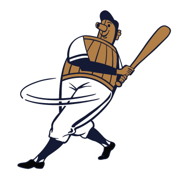
| 3. | The Beer Barrel Man logo. The Beer Barrel Man logo is synonymous with Milwaukee baseball from the American Association team to Hank Aaron's final playing days. Not only does the Beer Barrel Man link to that tradition, but it also provides the team with the opportunity for a mascot logo, which has been very successful for the Reds and the Mets since they re-introduced their mascots (for more on the Beer Barrel Man and his history, click here). | |
| 4. | A clean, solid design that is both contemporary and classic. The simple wordmark appeals to the timeless nature of baseball, while the dark, classic colors are very popular with fans and the general public. The piping allows the team color to shine through. The lack of names on the back signifies a return to tradition (names are a relatively new addition to the Brewers uniform, not being present on Hank Aaron's back or Robin Yount's when he smacked his 3,000th hit). | |
| Colors: |
Milwaukee
Brewers Lakefront Blue (Pantone 2767) |
Milwaukee
Brewers Festival Gold (Pantone 872) |
Milwaukee
Brewers Heritage Red (Pantone 200) |
| Logos: | ||||
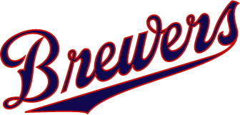
| Home Wordmark | ||||
 |
||||
| a graceful script evocative of the 1940s Brewers | ||||
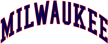
| Road Wordmark | ||||
 |
||||
| the city name signals pride in our hometown | ||||
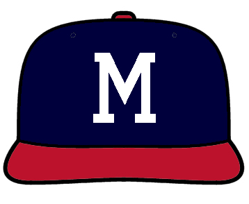
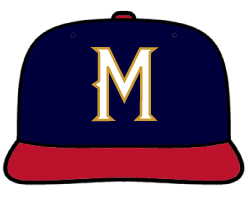
| Cap
Logo - the "Classic M" |
Sleeve
Patch - the "Beer Barrel Man" |
|||
 |
 |
|||
| originally worn by the Brewers of the American Association of the 1940s, this cap was adopted and made famous by the Milwaukee Braves. It's time to bring this cap home. | the symbol of Milwaukee baseball for fifty years, the Beer Barrel Man is re-envisioned for the 21st Century. He always swings for the fences! | |||
| Other possible cap designs: | ||||
 |
||||
Summary:
The "NEW CLASSIC" concept incorporates the best elements of the Brewers' past in a uniform concept determined to lead the club into a bright future.
Click here to continue on to the Summary Page
Click
here to view Concept #1 - "True Blue" again
Click
here to return to the Introduction