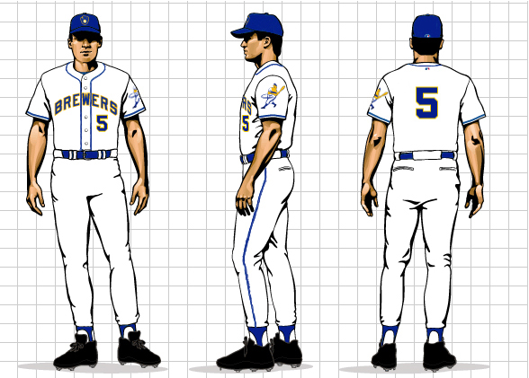
 HOME UNIFORM |
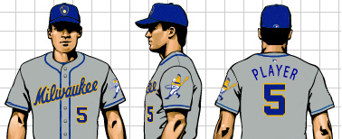 ROAD UNIFORM |
Philosophy:
Building off the very successful "Retro Fridays" uniform, this concept draws largely from the Brewers' great past, the days of "Bambi's Bombers" and "Harvey's Wallbangers," Rollie and Paul and Gumby and Rockin' Robin, giving the classic a modern twist.
Advantages of the "TRUE BLUE" concept:
| 1. | The original Brewers colors and wordmark. The design touches fans in a very deep way, telling us of the glory days ahead by reminding us of the best years of the franchise. The True Blue Brew Crew is back for good! | ||
| 2. | The famous Brewers logos. These are the logos most associated with the Brewers throughout their history. | ||
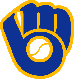
| • | The "Ball and Glove" logo of the American League glory days signifies a tradition, a bond between the Brewers and the fans. This is what most Milwaukeeans think of when they think of the Brewers. Robin Yount, Paul Molitor, Jim Gantner, Cecil Cooper, Rollie Fingers, Gorman Thomas and Don Sutton all played with this logo on their caps. | ||
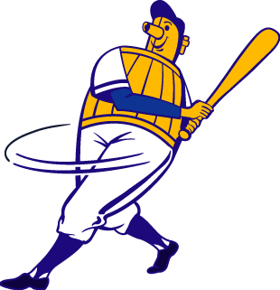
| • | The Beer Barrel Man logo is synonymous with Milwaukee baseball from the American Association days to Hank Aaron's final playing days. Not only does it link to that tradition, but it also provides the team with the opportunity for a mascot logo, which has been very successful for the Reds, Orioles and Mets since they re-introduced their mascots (for more on the Beer Barrel Man and his history, click here). | ||
| These two logos, used together, provide the team with unlimited merchandising options. | |||
| 3. | A clean, solid design that is both contemporary and classic. The simple wordmark appeals to the timeless nature of baseball, while the bright, optimistic colors are hugely popular. The piping allows the team color to shine through without the overcomplexity of pinstripes. The lack of names on the back signifies a return to tradition (names are a relatively new addition to the Brewers uniform, not having been present when Hank Aaron wore the Blue and Gold, when the Crew won the AL pennant or when Robin got his 3,000th hit). | ||
| 4. | A chance to lead the pack. The Brewers would be the first to capitalize on the fans' love for "retro" designs. The classic Brewers designs are consistently top sellers, and none of the other sucessful Cooperstown Collection teams (Padres, Astros, Braves) have capitalized on their popularity by adopting elements of the classic design in their everyday uniforms. This throwback cap is the highest seller in the country, and when was the last time you could say that about the Brew Crew? | ||
| Colors: |
Milwaukee
Brewers True Blue (Pantone 294) |
Milwaukee
Brewers Pennant Gold (Pantone 122) |
| Logos: | ||
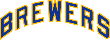
| Home Wordmark | ||
 |
||
| block letters are clear, crisp and immediately identifiable | ||
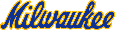
| Road Wordmark | ||
 |
||
| the city name signals pride in our hometown | ||
| Cap
Logo - the "Ball and Glove" |
Sleeve
Patch - the "Beer Barrel Man" |
|
 |
 |
|
| the very signature of Bambi's bombers and the American League pennant | traditional in Milwaukee for fifty years, the Beer Barrel Man is re-envisioned for the 21st Century. He always swings for the fences! | |
Summary:
The "TRUE BLUE" concept incorporates the best elements of the Brewers' past in a uniform concept determined to lead the club into a bright future.
Click here to view Concept #2 - "The New Classic."
Click here to return to the Introduction